THREE REASONS YOU NEED A SIMPLE LOGO
When designing a logo there are many things to look out for, we believe that simple logos are the key to success, but you have to do them right. The best logos require a great deal of effort and finesse. At the same time, they need to be simplistic and communicate quickly.
What you don't want is for your logo to be so simple that it qualifies as an icon. When you think of an icon you probably think of something like a phone icon or an information icon. The reason icons are bad for your logo design is because these icons are meant to represent something so that there are no words needed for you to understand them. While they do a good job representing that one thing, they do not qualify as logos as they are far too simplistic in design concept and effort. Yes, there are many successful companies with very simple logos but, they have earned it. When you see the Apple logo, you know what it is because of it's popularity. Without that popularity backing up their symbol, it's just an apple that tells us nothing about the brand. Another example is the Starbucks logo. Currently, they only have the symbol as their logo, but they had 'Starbucks Coffee' included in it a few years ago. Again, they earned it through popularity.
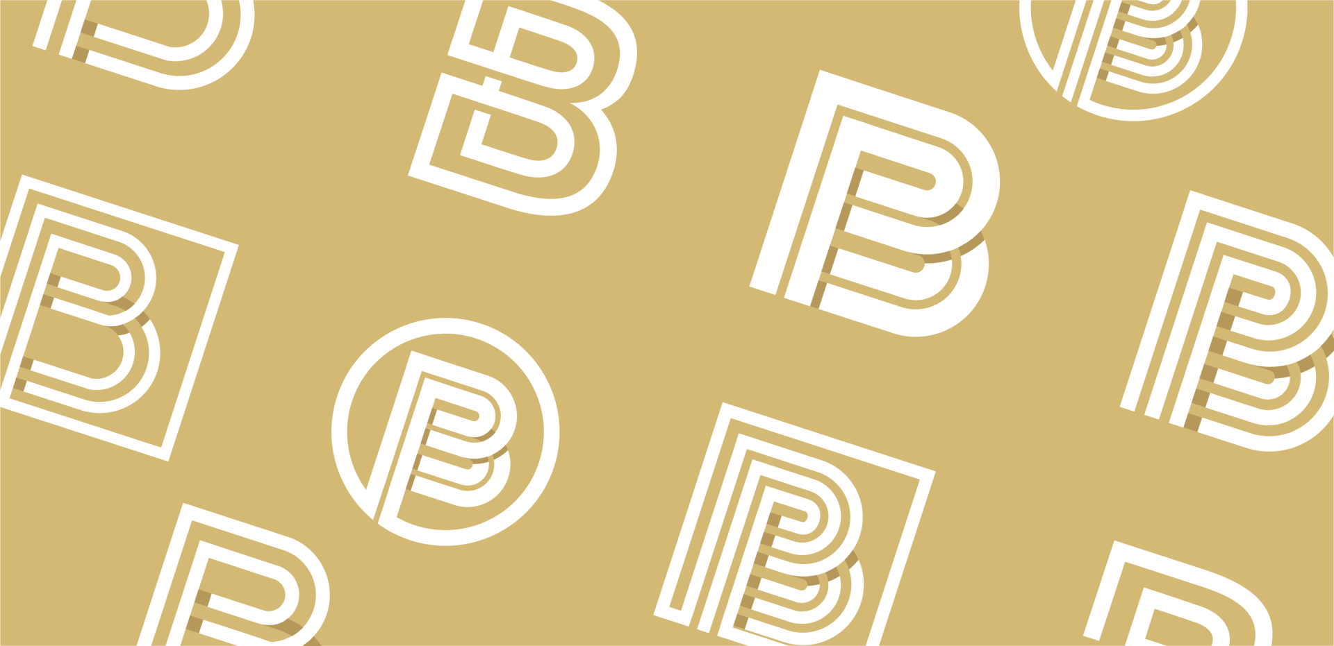
Your symbol representing your brand should be unique and have more than one concept. Now this is really easy to take in the other direction and have far too many things trying to be represented that your logo ends up being so busy and complex that it loses it's impact. Another major problem with having too many concepts in your logo is that it is almost impossible to make that logo look good when in a small format. If your logo is small or seen from far away, you should still be able to tell what it is.
Now that we know what too little and too much concept are let's talk about what is the right balance. This is easier said than done as every logo is different so there is more than one solution, but there are some key principles to follow: Clear communication, ease of readability and whimsical fascination.
Clear Communication
When someone sees your logo they should be able to instantly recognize what it is and what your business does. How are potential customers going to choose you if they only see your logo but don't know what it is that you do. Whether it be in your symbol, company name or tagline, one of those areas need to tell others what you do.
You probably don't have a choice when it comes to the company name as that was probably already selected, but if it does tell what you do, this makes your job easier as the symbol can be more abstract. The easiest one being the tagline because you can say exactly what you do there. If you are going to introduce what you do into the symbol itself, be careful, there are so many popular symbols that people use. When you think of a real estate agent you think of a roof top above their name or a hammer with a construction business. Think outside of the box. Don't do what everyone else it doing. If working with a realtor think about what makes them unique or maybe change a letter into a tool for a construction business. If everyone has already done the logo design you are about to do, what's the point in just making another cookie cutter design? Your logo should clearly communicate what your business is. If you can do this, you are off to a great start.

Ease of readability
When designing a logo it is really easy to get locked in and forget that not everyone will be seeing this logo at large scale in front of them. Depending on what the business is, it could be on a billboard or some sort of large format display. Does your logo still look good? This is a challenging part as there is a balance. Our trick for solving this issue quickly is by taking a step back from your computer. Make sure that you are far enough away that it is fairly small. Now you can see if the lines start to disappear if they are too thin or maybe they blur together if they are too thick. Now you can optimize the logo for all sizes easily with this simple trick. The logo should have the same impact at all sizes, not just when it is in a large, easy to see format. Another big one is font selection, this can make or break a logo as some fonts can be really hard to read. Make sure that the fonts you choose are easy to read by all.
Whimsical Fascination
Now it's time to chase that wow factor. There is nothing like looking at a logo for the first time and saying "wow, now that's clever". Not every logo can hit this mark though as often companies have long names or a tagline that gets in the way of creativity. Often there isn't a budget to be that creative as well, but when there is, that is the time to step out and get really creative with your logo design. Take the time to explore lots of options. Get some great inspiration and create something that is truly outside of the box.
Hopefully these tips are able to help you make sure the you next logo looks great. Remember that simple is good.